Design Awareness
By Mark Seymour
Logo is as logo does
I've stumbled across a hitherto-unnamed design concept: logomatopoeia.
Many people will recognize onomatopoeia; these are words whose sound ('bang' and 'buzz' are good examples) imitates what it names. (There are far more in Japanese than in English, oddly enough; see this site for a long list, but my favorite is definitely bashi bashi, the sound of smacking someone on the head.)
The word onomatopoeia itself comes from the Greek onomos, 'name', and poein, 'to make'. Thus logomatopoeia ('to make a sign' might be a rough translation) is the use of a visual reference to what is named within the logo.
The concept was discovered (Eureka!, to quote another Greek) when I noticed a restaurant directly across the street from a gas station in my neighborhood:
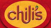
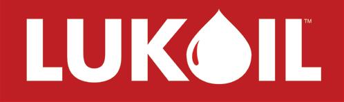
In both cases, your brain automatically incorporates the picture as a verbal component of the company name; you don't think "Luke-drop-il", you think "LuckOil". In the Chili's logo, of course, the apostrophe is silent, but it is still encapsulated in the name.
[ For the Russophones reading this, the parallel is even more amusing: "luk" means "onion" in Russian, and the "drop" on which Mark bases this connection is certainly very onion-like. Since the company itself is Russian, it is certainly more than just coincidence, and works well in two languages - although if the commodity was onion juice rather than oil, it would be perfect. -- Ben ]
As a beginning of standards-setting for logomatopoeia, the use of the chile image as an apostrophe is good, but the use of a droplet as the O is much better.
There is an alternate logo on the Chili's site which works even better as logomatopoeia (and may well prove to be the standard for excellence in logomatopoeia, though it's too early to declare a winner), but they may have feared people wouldn't be able to 'pronounce' it:
The Russian mother company of the Lukoil USA subsidiary also falls back on a more traditional (and far less successful) logo on its corporate site:
![]()
The LUK symbol would seem to represent chemical equipment, but it's really the acronym of the original Russian company, LangepasUraiKogalymneft. Given the history of the company ("by the Resolution of the USSR Council of Ministers No.18 of November 25, 1991, a state-owned oil concern was set up, uniting on a voluntary basis three oil-producing enterprises, Langepasneftegaz, Uraineftegaz, and Kogalymneftegaz", as only a Soviet-era document could phrase it), that may have been the best they could do. Besides, I defy any designer to make LANGEPASURAIKOGALYMNEFT work as a logo...
There are others out there, of course. Currently tied with the Chili's alternate logo as the logomatopoeia gold standard is the still-classic Fruit Company logo:
But there are also a slew of i-heart-whatever graphics that qualify as low-grade logomatopoeia, starting with the original:
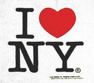
Logomatopoeia (like the one above) also qualifies as a rebus, and one of the reasons it appeals to me is that when I was a child my father used to leave me messages written in rebus form. (An early use of rebuses was in heraldry; for those interesting in these mind puzzles, try this rebus site.) And while text messaging on cell phones and PDAs uses the same content-compression style, though with a limited character set, we have all written a particular rebus at least once since our days in junior high:

While it might be hard to pull off a rebus-based logo, both these Rebus-named companies share alarmingly similar (though rebus-less) logos:


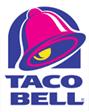
But logomatopoeia is a tricky thing, and there are many close-but-no-cigar logos, of which I chose only two:
Named after its founder, Gary Bell, the Taco Bell logo doesn't actually incorporate its symbol as part of the name, so technically it's not an example of logomatopoeia, but it's so close:
This bank logo shows another example of a good image (actually quite a nice rendition of the concept) that's not logomatopoeia either:

So now I'm looking for more logomatopoeia. If you find any, please email me and I'll list them (and credit you; there's no LinuxGazette t-shirt in it, bubba, merely the glory) in an upcoming column.
As an admonition about careless or trendy design, a friend pointed me toward this column on overused logo styles, and I found it piercingly true: the 'swoosh' is now officially ubiquitous. Here are several other excellent sites on the entire swoosh phenomenon:
There's also a site where you can purchase your very own swoosh logo for only $95.90 (though I wonder how they arrived at that precise pricing).
And even one on the sidestep from the swoosh to spirals:
For those interested in further meta-study of logo themes you can visit this site listing thousands of existing corporate logos. If you find another overdone trend like the swoosh, please let me know.
Next column (per a reader's request): more on the use of color and how it affects the viewer's perception of your material.
I started doing graphic design in junior high school, when it was still
the Dark Ages of technology. Bill Gates and Steve Jobs were both eleven
years old, and the state of the art was typing copy on Gestetner masters.
I've worked on every new technology since, but I still own an X-acto knife
and know how to use it.
I've been a freelancer, and worked in advertising agencies, printing
companies, publishing houses, and marketing organizations in major
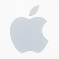
corporations. I also did a dozen years [1985-1997] at Apple Computer; my
first Macintosh was a Lisa with an astounding 1MB of memory, and my current
one is a Cube with a flat screen.
I've had a website up since 1997, and created my latest one in 2004. I'm
still, painfully, learning how web design is different from, but not
necessarily better than, print.
![[BIO]](../gx/authors/seymour.jpg)
